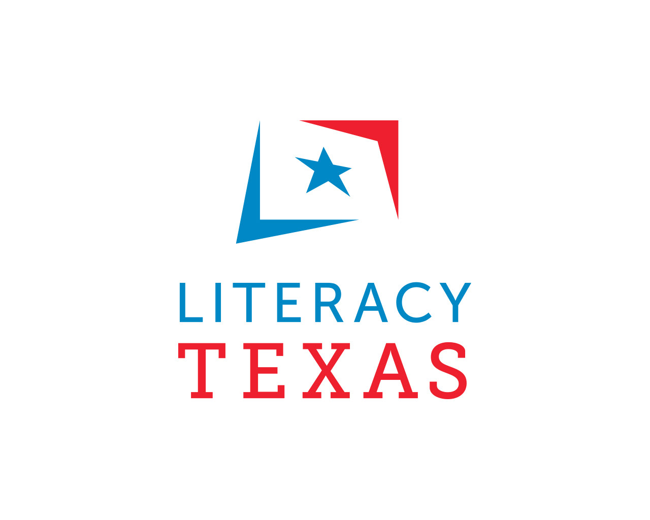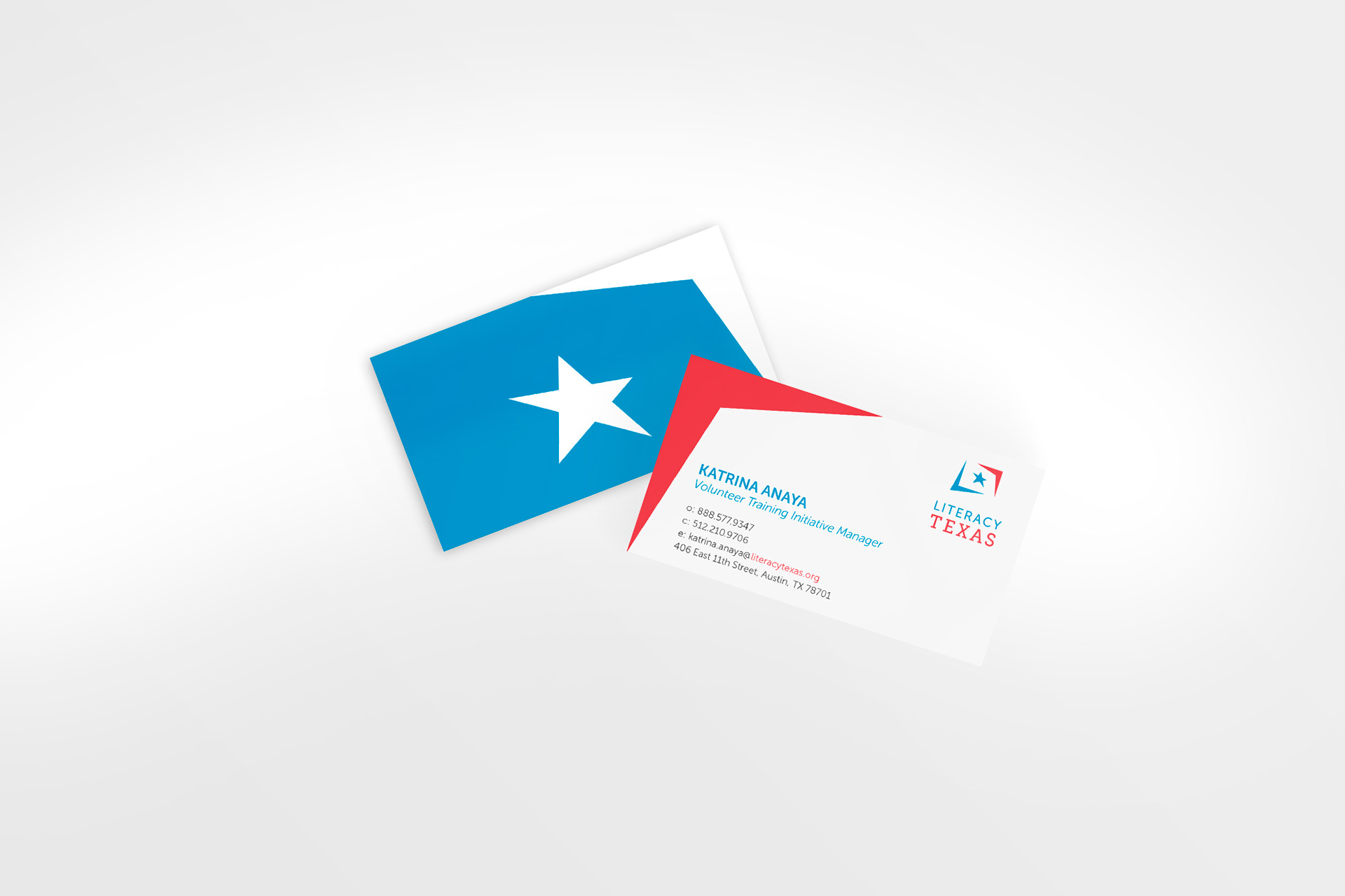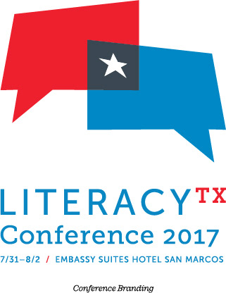
Literacy Texas believes that every Texan deserves to read, but how people read has changed over the 20+ years since they were first founded. This rebrand focused on the non-profit organization’s role in assisting literacy programs throughout the state by altering the traditional “Lone Star” color palette and motif to fit a more digital savvy and vibrant audience. Bold geometric shapes—referencing the letterforms “L” and “T”—house the Texas star as if it were projected onto a screen as a beacon of guidance and hope for all who wish to learn and participate fully in society.